Font Pairing
- Nov 9, 2016
- 1 min read


Font Pairing Project: Nicole Rosiak
Date: 11/9/16
What does it mean to create a font pairing?
A font pairing is finding fonts that work well together and using them in design.
What are the four assignments you chose to do? Write the name of the assignment and describe your design for each.
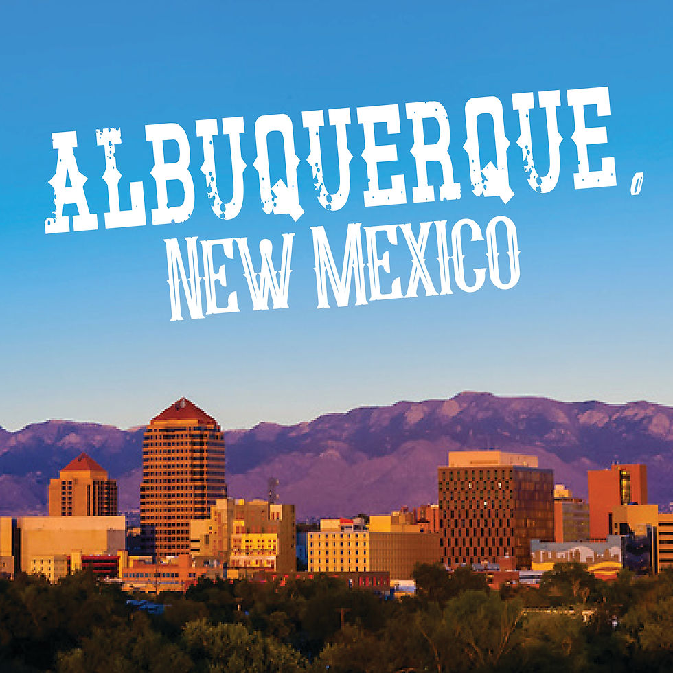
I chose to do Albuquerque, New Mexico, 26 Letters Endless Possibilities, these are the good ‘ol days, and the inspirational quote. I used skinny vs. thick fonts together, straight and curvy fonts together, and big vs. small fonts together.
Which assignment would you say is your BEST font pairing and why?
The “these are the good ‘ol days” font pairing is my best because the fonts came out great together using the standard vs. cursive technique. It also gives off a vintage feel that is pleasing to the eye.
Which assignment would you say is your Least Successful font pairing and why?
My least successful font pairing is 26 Letters Endless Possibilities because the color scheme made the font pairing seem a little off.
How would you describe the font pairing process? What makes a font pairing so difficult?
The font pairing process begins with finding several fonts and then narrowing it down to just two to four fonts. The fonts should look aesthetically pleasing together. Font pairing is difficult because it’s hard to have to go through many fonts to finally come down to a conclusion.


Comments